|
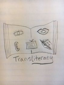
When I first approached designing a logo, I took to good ole paper and pencil. I needed to get the important symbols down to capture my idea. My desire was to capture the idea that reading is changing. The traditional notion of reading from a book is being modified by digital technology. Perhaps, someday, reading as I know it will be obsolete. Already, a vast amount of people already read, still rather traditionally, from a digital device. We already listen to audio books on a variety of media. The part of me that loves to curl up on the couch and lose myself in a good book for hours is scared and sad to see traditional reading change. The part of me that wants to embrace the benefits of innovative learning and teaching knows that I need to explore how these changes will revolutionalize literacy and, hopefully, bring literacy to more people. My first drawings for my logo included a book as the symbol of literacy as we know it now. The eye, ear, mouth, hand with a pencil, computer screen are meant to capture the ideas that we now “read” by watching media, listening to text, communicate it orally, by drawing and abbreviated versions such as texting and infographics. In one drawing I included people holding hands to show the communicative nature of reading and the collaborative nature that is being heightened and enhanced by transliterative media.
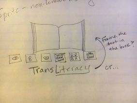
For my first digital draft I used Logojoy.com. (Click here to get a $20 coupon https://logojoy.com?referral=SJOC65b6b if you want to give it a try.) Logojoy first asks you to enter your company name, which I luckily figured out should be the basic topic of my web pages and capstone project. Next you enter a slogan. Then it asks you to pick at least 5 sample logos that you like. Next you can search an image library for up to five symbols/images. I chose simple line drawings of a book, an eye, ear, person speaking, and a computer screen. Then Logjoy generates sample logos for you. You scroll through and pick a favorite as a springboard. You then get to play with fonts, color, backgrounds, arrangements, and symbols. I knew from our discussions on graphic design that I wanted a sans serif font. I chose a blue color because it represents loyalty, dependability, trustworthiness. I toyed with the idea of using a purple color for creativity and innovation, but decided after seeing my logo drafts that seeing “reading” portrayed as people at a computer would be “new” enough. This is not a traditional idea for teachers to accept, so I needed the safety of the blue color! The hardest part was letting go of the multiple symbols I had created in my initial brainstorm. My first few drafts on Logojoy had only a book or a computer screen, but I wasn’t satisfied with that. I needed one image that captured the multiple learning modalities that transliteracy invokes: listening, watching media, speaking, communicating. I also kept remembering how our 792 Capstone professor kept reminding us that above all we should keep in mind that this is an educational logo. I needed a student in my logo. I found a single cartoon character person at a computer with headphones. Something was still missing. I just kept scrolling through more images until I found this one, which captures the idea that transliteracy involves more than one person. I am still not 100% satisfied. I am still wanting the image of book pages on here somehow. Perhaps framing the entire logo in book pages? Perhaps a small line drawing of a book right before the words “Reading For All”? Perhaps a book image between Trans & Literacy? In the end I know that a logo should be clean and can’t capture the entirety of an idea, so I would let go of this monkey on my back.
2 Comments
Nai Saelee
10/16/2017 04:50:32 pm
Nancy,
james landis
10/19/2017 02:56:25 pm
Nancy, Leave a Reply. |
Nancy JaminetArchives
December 2017
Categories |
 RSS Feed
